31 August 2017

Link roundup for August 2017

This month’s nominee for “Best poster ever” comes from the Ecological Society of America (ESA) meeting, and was created by Julian Resasco, with pictures by Andrew Bell:


I got multiple people forwarding this to me, and saw many positive comments on Twitter, so this one is definitely a fan favourite. I am hoping Julian will submit this to the blog so we can talk about it in more detail later! Hat tip to Jacquelyn Gill, Michele Banks, and Megan Lynch.

The ESA meeting also gave us a candidate for “best poster reuse”:


Hat tip to Nathan Emery and the Ecological Society of America.

Data is the Spotlight is a blog that does for figures what this one does for posters. Hat tip to Arjun Raj and Prachee Avasthi.

Terry McGlynn makes an important point about conference scheduling, using the ESA meeting as an example:

Many with “late-breaking” posters are stuck on Friday because they weren’t aware of the deadline, or didn’t have funding 6 months ago. Who is most likely to not get the heads up about the deadline? Undergrads, and folks who aren’t surrounded by ecologists at work. I was bummed to see so many undergraduates - the future of our field - lonely at posters on this Friday morning. If we’re taking student development and equity seriously, can we not punish folks who miss the deadline with a crappy time slot?

(A) poorly attended talk will have people at it. But a quiet poster session can have zero visitors and that’s crushing.

Keeping with that theme of scheduling, I’ve noted on the blog several times that most people prefer both giving and listening to talks at conferences. Because talks are perceived as “better,” there is the potential for those slots to be biased towards certain presenters. A new article by Sardelis and colleagues recommends that conference attendees should be assigned talks or posters at random.

To avoid bias toward later-career men filling presentation slots, conferences should randomize program assignments. Delegates could be informed of and agree to this format in advance of submitting an abstract. Accepted abstracts can be randomly assigned to full oral presentations, speed presentations, or posters, making each program presentation category more diverse.

Hat tip to Craken MacCraic.

I’ve been expecting conferences to go fully electronic for their posters for some time now.


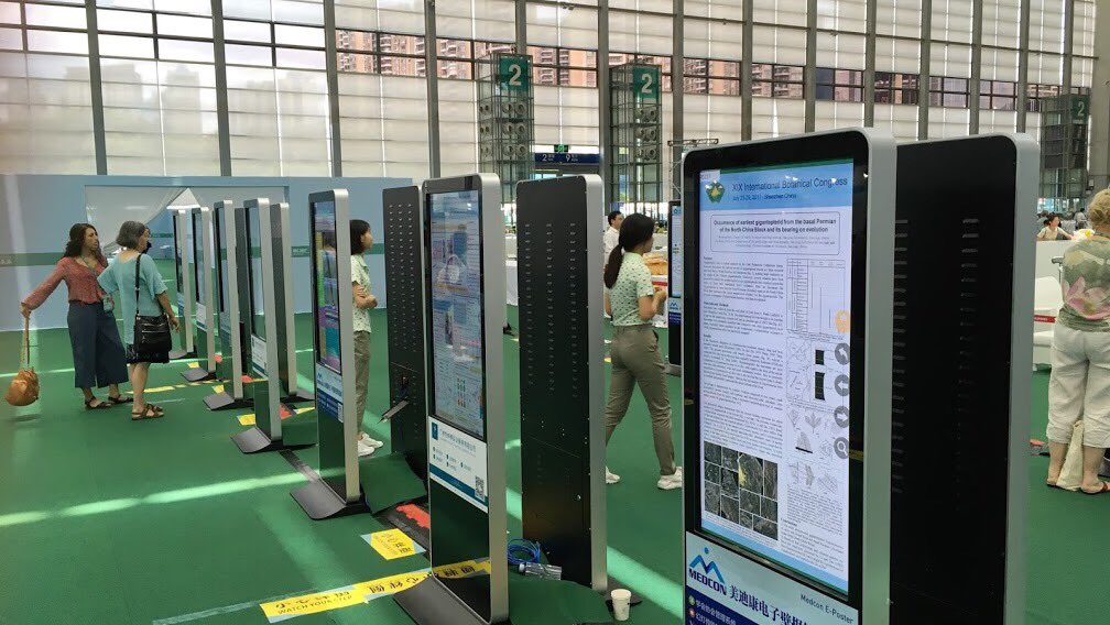
We’re getting closer to this becoming the norm, as this picture from this year’s International Botanical Conference in Shenzhen, China shows. Picture by Robbie Hart; hat tip to Richard Prather.

Brittney Monus is ready for electronic posters:

Pros of traveling with a poster tube: you get to meet other tube-carrying #ESA2017 people at your gate. Cons: literally EVERYTHING ELSE.

But poster tubes matter! Melissa Márquez has a blog post outlining her presentation tips for posters. There’s a little bit of design, and a few other tips rarely talked about. For instance, the importance of a poster tube:

I travelled from the US to the UK without a poster case and I was a bit embarrassed by how wrinkled mine ended up being.

Hat tip to Melissa Márquez.


Looking for some lettering to capture the look of vintage scientific figures? Try the Routed Gothic font (sample above). Apparently, some scientists want their figures to look like they came from the 1940s. Hat tip to David Shoppik and Charles Poynton.


And if you like the handwritten look but recognize that Comic Sans is not up to the job, try FF Uberhand, sampled above.

I’ve written about the importance of considering colour blindness when designing posters. This post has the same take home message – colour blindness is common, design for people with this condition – but Oliver Daddow’s first person perspective provides welcome clarity about its importance:

Opinion polls, leadership ratings, PowerPoint lecture slides, pie charts of public expenditure, Brexit negotiation flow charts, political party election manifesto summaries; all get the full treatment. Most books and journal articles are limited to publishing graphics in black and white, due to the cost and other barriers to the use of colour in mass printing. On Twitter, however, they are presented in a veritable riot of colour. In an aesthetic sense, why not?


The problem is that, being colour blind, I can only read around half of them at best. I can spend time deciphering what is going on in a few of the remainder. The rest remain an impenetrable mass of lines and words, the content of which is meaningless, unless some kind soul provides an accompanying narrative, which in 140 characters is, really, impossible. Where colour “normal” Twitter users can process the data quickly and move on, having learned something new and valuable, the colour blind either must spend a long time fathoming it, or are physically unable to process the data at all.

This is a list of ten tips for getting the most out of conferences. The plot twist is that this list is full of tips by students, who are still new to the whole conference experience. Here’s some material about posters:

Nicki Button: Poster presentations at first seem easier than oral presentations. But they provide the opportunity for one-on-one conversations, which can either be extremely beneficial for advancing your research or extremely stressful (or both!)

Embrace poster presentations as opportunities to learn from experts in your field. Pick their brains for suggestions and invite them to collaborate on your research. To prepare for your poster presentation, practice an elevator pitch and write out and answer all possible questions that someone might ask you. Practice in front of your lab group and non-scientists. Even though this isn’t a formal presentation and you might not ever present your pitch exactly how you prepared it, it is still fundamentally a presentation.

Hat tip to Paige Jarreau.

When I started the blog, I did some posts exploring basic terminology. But that’s been a few years ago now, so if you’re looking for a refresher, here are 50 terms used in graphic design. Hat tip to Garr Reynolds.

Cory House nailed something that I think is lurking in the background of this blog. I’ve said from time to time that posters are not just to convey information. Cory put it this way:

After attending many conferences, I’ve realized: I don’t attend to learn. I attend to learn what I need to learn.

A conference speaker’s primary impact isn’t teaching... It’s getting you excited enough to learn more.

Conference speaking is sales, for ideas.

Too often, academics focus on posters as vehicles for information. They treat them like a research manuscript on a single piece of paper. And they kill the excitement that way.

Hat tip to Melissa Vaught.


24 August 2017

Critique and makeover: Hot Mediterranean

Today’s poster comes from Francisco Pastor. Click to enlarge!


I like the central part of the poster. It’s very visual and colourful. The two columns are so clear you could probably do without the central dashed line. There are some alignment problems that could be easily fixed. For example:


On both the left and right, there are twelve maps, arranged in three columns by four rows. On the right, the right edge lines up with the bar above them, but on the left, they don’t. Similarly, the rows are squished together on the right, but not on the left, even though the left needs more space, because it has a bar graph immediately below it.

But I can live with that.

It’s the corners that are driving me nuts.

This may be a little hard to see unless you click to enlarge, because the white poster background on the white black background makes it hard to see the edges. While the central material has been given generous white space, every corner is crammed to the edges.

Here’s a closer look at the top, as if it were on a poster board, so you can see the edges better:


I am not sure you could hand this poster without sticking a tack through the institutional logo (not a great loss) or the author credit (that is a loss, because that matters).

I have no idea why the author credit is aligned with the right side of the poster.

And here is the bottom:


Again, notice how the text in the bottom right is positively threatening to overflow its container, and the logo on the left wants to pop out of its box like a stripper out of a birthday cake.

When so much of the poster is set in a clean serif font, it seems strange that the bottom suddenly switches to a script font. And not a very readable one at that. If you want to use two fonts, that’s fine, but both should be used throughout the poster.

Here are some changes to the bottom of the poster to tidy it up. Spot the differences!

  1. Shrunk the text in the bottom right corner box by 90%.
  2. Moved the text in the bottom left corner down to a more central placement.
  3. Removed the dark blue line around the box containing the concluding four bullet points.
  4. Shrunk the concluding four bullet points by 90%.
  5. Fixed one pixel overlap of “Acknowledgements” box on the two dark blue boxes it touches.
  6. Realinged “Acknowledgements and references” text so it was left aligned with the text below it, and closer to the optical middle of the light blue bar it is in.

The moral of the story is: Every part of the poster needs the same attention to detail.

17 August 2017

Critique: Measuring negativity

Today’s poster is from Jonathan Mohr. Click to enlarge!


Jonathan says of this poster:

Our study focuses on measurement, which is a pretty dry topic. I can’t say we’ve made any progress on making the material come alive. However, we’ve tried cutting down the amount of detail (which may be hard to believe after viewing the poster!) to create at least a bit more “white space” (actually not white, but you know what I mean).

I sympathize with the problem. Some topics are more visual than others. Measurement tends to be less visual.

This poster was based on a template provided by PosterPresentations website. Using a template has pros and cons. Here, the “pro” is that the template provides a clean layout, with everything aligned nicely. Nobody will get lost reading this poster.

The “con” is that I am skeptical of some of the colour choices. The poster looks muddy and monotome. The text has a low contrast against the background, especially at the bottom. This isn’t bad in the middle, where the darkening background helps make the graph more prominent. But the text on the left and right hand sides fades away. The author credits are hard to read.

A few small points of contrasting colour would go a long way to adding some clarity and interest to this poster. Adobe Color suggests some cyan blues would be a good contrast to the tans.

As Jon notes, the biggest challenge here is the amount of detail. Editing always feels tough to impossible, but I have some tips here. I do appreciate that this poster starts with “Key points.” If you know you have a lot for people to read, a summary is not a horrible idea.

If you have a text heavy poster, as here, consider not using one of the standard fonts. This one is mostly set in Times New Roman for the main text and Calibri for the headings. Those are workhorse typefaces for a reason, but they are not distinctive. And they are maybe even a little out of date now. Look at new fonts, play with alternate character sets. There are thousands of typefaces out there! Splurge and buy something new! That can help break the visual sameness of a text heavy poster.

Related posts

10 August 2017

Critique: Nanotechnology versus climate

Today’s poster is from Jacob Martin, which he presented at the Commonwealth Science Conference. Click to enlarge!


Jacob wrote:

This was to a very diverse group of scientist and policy makers, so the poster is made for a general audience. The font size is relatively small as I wanted to draw people into the poster to read it and as the poster was A1 (Note to Americans: That’s 23.4 inches × 33.1 inches. - ZF), it was not too difficult to read. While presenting the poster, a lot of people wanted to read the whole poster before then asking me questions about it. I assume this is because of the small amount of text on the poster meant they could commit to reading it.

I played around with linking the text with aspects of the graphs using arrows and underlined brackets, as I find it takes a lot of text to fully explain a plot without these devices. I also made use of the perspective in GIMP to make the graphs stand out, but this made them a bit harder to read.

I agree with Jacob’s assessment that adding perspective to the images was perhaps a bit of unneeded flash. Here’s a blow up so you can better see the use of perspective, arrows, and brackets:


I understand the goal here, but I’m not sure if this is an optimal solution. In this particular example, that the arrows are laid down flat over the graph’s Y axis and label bugs me.

I am not a big fan of photo backgrounds, but this one works better than most. The “busy” parts of the photo, the plane and the sun, are removed from the text. The text sits over parts of the photo that are mostly colour gradients, with very little complexity.

Having the four main text blocks circle the plane creates a nice focal point around the plane and the title. This is fortunate, because the title is a little undersold here. The black text, particularly the first line, is not very high contrast against the dark blue of the sky image. Using italics makes the title feel like fine print, rather than the most important thing on the poster.

The circles are also a nice visual change from rectangles, and make the poster look distinctive.

The logos are nicely corralled down in the bottom, where they are aligned with each other and not intrusive.

This poster works well from a distance. It has a strong and distinctive look, and it feels inviting. I am not sure if the details are as successful when you get in close-up. The text and line weights feel a little bit too fine and fussy for easy reading.

07 August 2017

New email address for submissions and Twitter feed

I have created a couple of new resources for this blog.

First, and more important, the blog has a new, dedicated email address: BetterPosters@gmail.com. If you would like to submit a poster to the blog, or get in touch for anything else poster related, please mail me at this address. (DoctorZen@gmail.com still works, too.)

Second, the blog now has its own dedicated Twitter feed: @Better_Posters. That’s “Better underscore Posters.” The plan is that this will be an automated feed that will tweet out new blog posts. Blog readers on Twitter no longer have to wade through my other random thoughts about crayfish, scientific publishing, Doctor Who, or what have you. (Those are all still available on @DoctorZen, too.)

03 August 2017

Critique and makeover: How to recognize birds

Today’s poster was presented at this year’s Evolution 2017 meeting by Stephanie Aguillon. Click to enlarge!


Stephanie spelled out her design goals with this poster:

I worked really hard on minimal text and focusing on visuals. ... I think this is one of the best posters I have designed.

Stephanie achieved her goals. Her poster is graphic, it’s bright, and you can pull out the main points very quickly. She clearly put some thought into her colours, using them consistently to identify her different bird populations.

I wouldn’t change much on this poster, but nobody reads this blog for “Yup, it’s good” and no suggestions. The first thing I tried is to go Samurai Jack on the boxes and get rid of the thick black lines:


My next concern is that the graphs for the results are quite close together. I tried shrinking them by 95% in the version below.


I also shrunk down the Cornell logo, so that it was roughly the same height as the Cornell Lab of Ornithology. Then, I nudged both logos so that the right side of the Cornell logo was in alignment with the right side of the title, and both were in line with emails in the author’s credit. Alignment is good!


I didn’t change it here, but the “Results & Discussion” section lacks a clear visual hierarchy. Here’s the problem.

The “Results & Discussion” heading is all caps and set large type, both of which are visual cues to importance. But the two sentences below the heading are almost as large, and set entirely in bold text. Bold text is another, different visual signal for importance. Consequently, the two bits of the poster are sending conflicting messages about which is more important. So rather than emphasizing the text, the bolding across the board ends up lessening the impact of the text.

Stephanie printed her poster using Spoonflower (which I mentioned a while ago). Here’s how it looked on the day:


The colours are vibrant, but you can still see some distortion from the fabric stretching near the tacks. I think I still prefer paper for most purposes.

The changes, animated to make comparisons easier: