30 April 2015

Link roundup for April 2015

While this blog is mainly about poster sessions, poster sessions happen in the larger context of academic conferences. I love conferences, and part of the reason I write this blog is so that people can have good experiences at those conference sessions. Those good experiences do not include harassment. That’s why this blog post by Timothée Poisot is this month’s must read:

Across all ecologists we surveyed, 37% witnessed harassment, and 24% experienced it, at least once, only taking into account what happens during scientific meetings. This… wow, this is a lot. ...

1 out of 3 people is not an epi-phenomenon.

The post also shows strong support for organizers to be much more active in dealing with harassment. If you’re involved in organizing a conference, there are steps you can take to make them better and more welcoming. Take them.

I’ve often lamented that most posters are designed by amateurs. I have rarely seen a case for using professionals as compelling as this ad, which was a full page in several American newspapers:


It’s an attractive and well designed ad. Except for one thing.

The brain is backwards.

Not being able to get a brain the right way round is not the signal you want to send when you are trying to announce a “new era of discovery in brain research.” There are professionals who do medical illustration stuff for a living. Hire one. (Hat tip to Mo Costandi.)

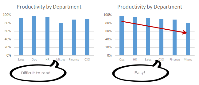
The bar graph is a standard way of presenting data. A new PLOS Biology paper argues that it’s a bad way regardless of its ubiquity. Hat tip to Gaetan Burgio and Michael Hendricks.


Nevertheless, the humble bar chart is likely to remain a major workhorse for data presentation for a long time. Here is a short list of good tips. Hat tip to Garr Reynolds.


I Want Hue bills itself as a tool for “data scientists.” Its claims:
Distributing colors evenly, in a perceptively coherent space, constrained by user-friendly settings, to generate high quality custom palettes.


Looks interesting. Not sure why the colours jiggle when you make palettes, though. Hat tip to Dean Malmgren and Justin Kiggins.

I’ve always been skeptical when I’ve heard mathematicians and others wax rhapsodic about the “golden ratio.” This article calls it “design’s biggest myth,” and I­’m inclined to agree. But maybe that’s just my confirmation bias. Hat tip to Tommy Leung.

Peter Newbury asked:

Conf poster style question: do you use present tense, as in “results are calculated by...” instead of “results were calculated by”?

This isn’t just a conference poster question, but a general scientific writing question. In general, any methods are in past tense, because you’re describing something that already happened. Results are often in present tense, because the effect you’re describing should be generalizable to past, present, and future situations. To put it another way, we write “E is equal to mc squared,” because it’s always true. You might write “E was equal to mc squared” if it was only true once.

Graphic designer Ellen Lupton has a book coming out in June that was an instant pre-order for me: How Posters Work.


Expect a review as soon as it arrives and I devour it, as I surely will. There is an art exhibit to check out if you’re in the New York area.

Haas Unica is an old typeface that has been made new again. It’s the sort of sans serif workhorse that works well in posters. Hat tip to Timothée Poisot and Genegeek.


Jarrett Fuller ruminates on his love of all sorts of posters, not just academic ones.

Throughout history, you could group posters into three purposes: to inform, to persuade or encourage, and to commemorate. Sometimes it straddles the lines between each of these, but the poster’s purpose must always involve one of them.

Alex Holcombe wants you to know this.

Each word you put on your poster reduces conference-attendee approaches by 0.2%. People need to know my invented statistic.

Now they know, Alex. Now they know.

16 April 2015

Variations on a theme: crayfish nociception

Back in 2010, I had just co-authored a paper on crustacean nociception with Sakshi Puri. At the time, we had already started the follow-up experiments that have just been published.

Now there was a bit of a gap between the two papers, which means that this research was presented at quite a few conferences. Six of them, all told. Click on any to enlarge!

The first poster in the series was for the International Association of Astacology in 2010. This one shows how many of the experiments that made it into the 2015 paper were already in the can (to borrow an old movie making phrase) back in 2010!

Graphically, the red used in the central graph in the middle was picked up from the colour of the crayfish in the pot on the upper right. The greens used in the headings were picked up with an eyedropper from the colour of the wasabi.

While the crayfish boil provided a nice illustration of the question that initially motivated these experiments, it’s hard to make out that they are crayfish from a distance. The rest of the posters have big pictures of individual crayfish, or their close relatives, lobsters.

Later that same summer, I attended the Ninth International Congress of Neuroethology in Spain. This one is different from the others for two reasons:
  1. It was the only one in portrait format (and a fairly small total size, too). I’ve heard fairly consistently that posters for European conferences are portrait more often than North American conferences.
  2. It was made in PosterGenius (reviewed here) rather than Microsoft Publisher.


I switched from the picture from a shot of many crayfish in a pot to a single lobster in a pot. As a result, the colour palette for this poster completely changed. The lobster is greys and blues, so the graph and headings are those colours, too.

Making this in Poster Genius was a challenge, because I recall it being difficult to adjust the size of the text. I couldn’t use my usual trick of making the text for the references smaller, so I struggled greatly to make everything fit. As a result, this poster came out rather text heavy.

The following summer,  in 2011, I went to The Crustacean Society meeting. We had done more experiments over the year, and this was the first appearance of the behavioural responses to high temperature stimuli. Video gives a much better sense of the behaviour than any graph, so this was an early appearance of a QR code that people could scan to watch the video. I don’t recall many people using it.

This was also the first appearance of the title that my co-author, Sakshi Puri, wanted our paper to have, and which ultimately became the title of the paper. When we started the experiments, I’d joked with her that I’d wanted it to be, “Do crayfish like spicy food?”

I also think Sakshi asked for us to set the poster in Time New Roman rather than sans serifs.


I think of all the posters, this one is, in some ways, the least successful. There was a lot of space at the bottom that are filled with pictures that could go anywhere. And the spacing between the habanero and wasabi pictures is a little too wide. The colours used for the spikes are a little bright.

I was pleased to have found a lovely crayfish picture from Michael Bok that appears on several later posters. 

In fall of that year, we took this project to “the big show”: the Society for Neuroscience meeting in 2011. (Sakshi blogged about her experience here.)


This paper is a little reminiscent of the first one in this series, in that it uses a lot of red for graphs and headings. The heading here was a font called Orial that has some nice detailing, although in retrospect, it was a little too subtle for people to notice.

People scanned the QR code a lot, according to Sakshi.

This meeting was important, because another poster at that meeting had a technique for studying responses to low temperatures, using dry ice. We did that experiment soon after, and it made it onto the next iteration of the poster.

In 2012, I presented at the Tenth International Congress for Neuroethology.

I was proud of the use of the two callout boxes in this one. I thought the light red backgrounds were sufficiently different to signal that these were not part of the main narrative, but subtle enough not to be distracting.


I did away with headings, using drop caps as another way to signal sections.

While the QR code still appears with a link to a video of the behaviour, that was purely a backup. Most of the time, the code was covered by my new iPad that I stapled to the spot. I carefully designed the code and the text so that it would not be seen when the iPad was on top of it. This meant that much of the poster was designed around how big my iPad was! The width of the iPad helped determine the column width, and therefore how many columns the poster would get.

One of the big sticking points in publishing the paper was trying to get neurophysiological records from the claw, which are shown on this poster. These didn’t make it into the final paper. Ultimately, that proved too hard to get good recordings, so we went back to using the antennae, which we’d used in our 2010 paper.

The final version of the poster appeared at the Society for Integrative and Comparative Biology meeting in early 2014.


I was happy with the picture I found as the entry point. I love the expression on the woman’s face, and it perfectly reflects why people are always asking about, “Are lobsters / crayfish / crabs / shrimp hurt when they’re cooked?”

Again, there are reds in the graphs throughout, because of the colours in the animals and the Nature article screen grabs.

While I often rail against boxes, I tried them here. I think they work because rather than putting a box around each individual part, I used the boxes as column separators. I’d seen this done occasionally in magazine and newspaper layouts. I went for extremely light lines (they look finer on the poster than in the image here).

When seen all at once, in this small format, several of them look a bit busy because of the physiology recordings. They often look very busy, and they use a lot of colours. The last two posters perhaps fare a little better because they don’t have those complex charts.

In looking at these again, I am pleased to see what I think might be some progress. The last two are, I think, a little more successful than the earlier ones. After all, for the first ones, I’d only been blogging about poster design for about a year. By the time I did that last one, this blog was closer to five years old.

Do you have a favourite?

Related posts

Small conference, big conference
iPoster

References


Puri S, Faulkes Z. 2010. Do decapod crustaceans have nociceptors for extreme pH? PLoS ONE 5(4): e10244. http://dx.doi.org/10.1371/journal.pone.0010244

Puri S, Faulkes Z. 2015. Can crayfish take the heat? Procambarus clarkii show nociceptive behaviour to high temperature stimuli, but not low temperature or chemical stimuli. Biology Open: in press. http://dx.doi.org/10.1242/bio.20149654

09 April 2015

Critique: Build a better turbine

Today’s award-winning poster is courtesy of reader Jennifer Rinker. It was presented at the CU Energy Frontiers conference, where Jennifer walked away with the win in the “Electricity Generation and Storage Category.” Click to enlarge!


Jennifer writes:

At one point I was chatting with one of the judges briefly, and he enthusiastically told me I was getting full points for clarity.

I can see why. This is very clear.

The clarity is even more impressive because the poster uses a slightly unconventional layout: two horizontal sections, subdivided by vertical columns. While removing lines is often one of the first things I do to improve a poster (see below), the horizontal line here provides a clear cue of how to read the poster. It also serves the role of “grounding” the figure of the turbine, so it isn’t floating in space.


Because this poster has such a light touch – ample spacing, subdued colours, fine lines – the table near the center surprised me a bit. The table is emphasized in three ways:

  1. It’s printed in large, thick letters;
  2. Against a darker background, and;
  3. Inside a box.  

Any two of those are probably enough to highlight the table. I tried taking away the lines of the box:


The table harmonizes with the rest of the poster much better without the box. I’d perhaps increase the contrast between the table’s background and the background of the rest of the poster.

Cream and off-white colours are very attractive for posters, perhaps because they mimic the look of printed pages in books, which are rarely perfectly white. I would be tempted to go just a hair lighter in case this poster was someplace the lighting was bad. I tried a quick and dirty colour replacement. This wipes out some of the fine lines, alas:


I’m also pleased to report that this blog – and, more importantly, the many people who have shared their over the years – had a small part in this poster. Jennifer wrote:

I designed it based on a lot of your critiques and comments on poster blog. ... I was inspired by some of the really fantastic posters on your blog.

All part of the service!

02 April 2015

Belated blogiversary: six years on

 
Wow, I have been so busy recently that I completely blew past the sixth blogiversary of Better Posters! (The proper blogiversary date was the start of March, not, um, April.)

That this blog is still as active as it is today is thanks to many, many contributors who have been generous enough to share their posters. Thank you all.

Photo by kathryn on Flickr; used under a Creative Commons license.

Critiques: Icy bodies

Today's poster is from Terik Daly, and was presented at the last Lunar and Planetary Science Conference. As always, click to enlarge! Enlarging always helps, but this one is particularly enhanced by increasing the size a bit.


My first thought was, “This is going to be a short critique.” That this was a crisp and professional design leaped out right away.

This poster makes excellent use of a grid, with plenty of space between elements.

The typeface is either FF Din, or something very near to it. FF Din is a typeface that is used quite often by professional designers, but almost never by scientists, because... it’s not a standard font in Microsoft Windows. The Din fonts were originally designed for railroad signs, so they have the advantage of being legible from a distance, and are quite compact, too, which is a nice combination for a poster.

While my dislike of logos in titles is well documented, Terik does it right here.The logo is occupying a space that would otherwise by empty, so it is not chewing up any valuable poster real estate. The logo is transparent, leaving no identifiable “box” fingerprint around it. The logo sits comfortably in the poster, rather than fighting for space on it.


I like the idea of having the short summary below the authors’ byline. The problem here might be that the summary is a little too similar to the title bar above it. It might benefit from being a different colour, or something to make the text “pop” to let readers quickly identify this as the main text, not the sort of mostly minor details you normally find under the authors’ names (institutional affiliation and the like).

The only thing that is a genuine error, in my view, is in the top central graph, where one of the data labels crosses the X axis. The label just needs a slight nudge upward, and it would be more readable and attractive without sacrificing any clarity of which line it’s associated with.

The poster is a little drab right around eye level: it’s black and blue text right across the board where my eyes will glance first, under the title bar.

I like images on posters, and would like to see the pictures here play a more prominent role on the poster. Unlike some posters, I don’t know what I would change on this one to make that happen. There always is another way, naturally, but in this case, it would probably demand a wholescale editing and reworking of the text. The overall layout is so clear that I’m hard pressed to imagine this poster in any other way.

External links

FF Din